

Which is my best side?
I just missed half naked Thursday, a concept I really do like. But I'm still in time for fabulous friday no?

Here we have an artsy fartsy wannabe AJ

This is the Dark Demon From Buffy. Look into my eyes... what eyes?

Simply Hot Pink
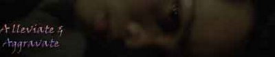
This is the cool understatement.
And if anyone has anything to say about my *cute* *adorable* *average* foreead, there will be hell to pay. So which one do you think I should use for my banner? I'm thinking of going with the understatement....
You know I can't change, I can't change, I can't change,
but I'm here in my mold, I am here in my mold
And I'm a million different people from one day to the next
I can't change my mold, no,no,no,no,no
I can't change my mold, no,no,no,no,no
I can't change my mold, no,no,no,no,no
It justs sex and violence melody and silence
The Verve~ Bitter Sweet Symphony
posted by AJ @ 9:30 PM
![]()
![]()
13 Comments:
use #2 - bannerish and yet stylish (like the font under a&a)
#1 too messy (can't hardly read a&a there)
#3 too plain
and am not too crazy with font in #4.
If you use the pink banners, you have to change the whole colour scheme here.
My vote is either #2 or #4. ;P
Understated.
But you shouldn't listen to me, I'm a lesbian and therefore have no taste by default.
Use all four lor. Every now and then you can just change your banner and give your blog a mini makeover!
You mean out of hundreds and hundreds of photos, only TEN came out well? BWAHAHAHAHAHAHA!! *Dodges a flying shoe*
I pick #2, but without the A&A cuz the font beneath it is really quite hot.
I like the fifth one which you are all naked. :) There is one, right?
But I am with paul. The second one does look great actually
Yay for AJ's face!
Like the second one actually.
Paul
My vote goes for #2! Like the 'what eyes' bit :)
There's a fifth one? Show!
Otherwise, pic #4 is good with font from #2.
2nd one... the clearist i think.
Yeah, I agree with jay&kay. #4 with the font from #2. And show us #5. :o)
*heh* guys, thats for the superb comments & suggestions. The goat said he could do better and I think he did a pretty decent job for these 4 (he actually made another 2-3 that I didn't think were suitable).
And there were hundreds of pics that were good, just I made ten banners. I have one more... That I really like
*gasp* I'm not the only one? methinks the pink one's best :D
Post a Comment
<< Home